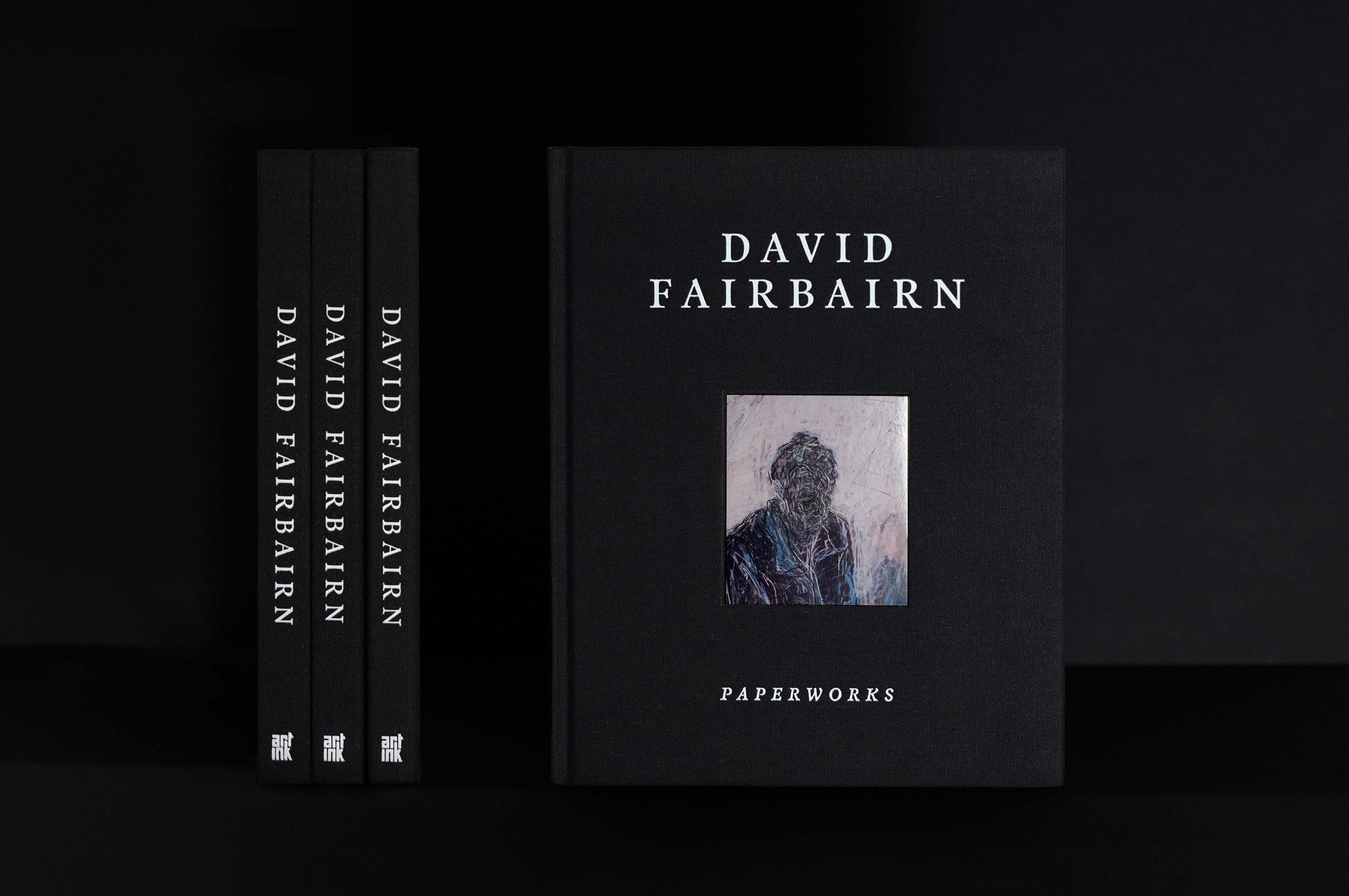
Paperworks documents the decades-long artistic practice of David Fairbairn, an artist whose portraits can take months to complete. Blurring traditional printmaking techniques with painting and drawing, Fairbairn creates intimate portraits, once described by Professor Sasha Grishin as “monumental and larger than life…they emerge like living entities surrounded by air. They possess a breathing lightness and exist within a spiritually charged space.”
I worked with Fairbairn at Hayman Design to create a classic, refined publication designed to stand the test of time, reflecting the enduring beauty of his artworks.
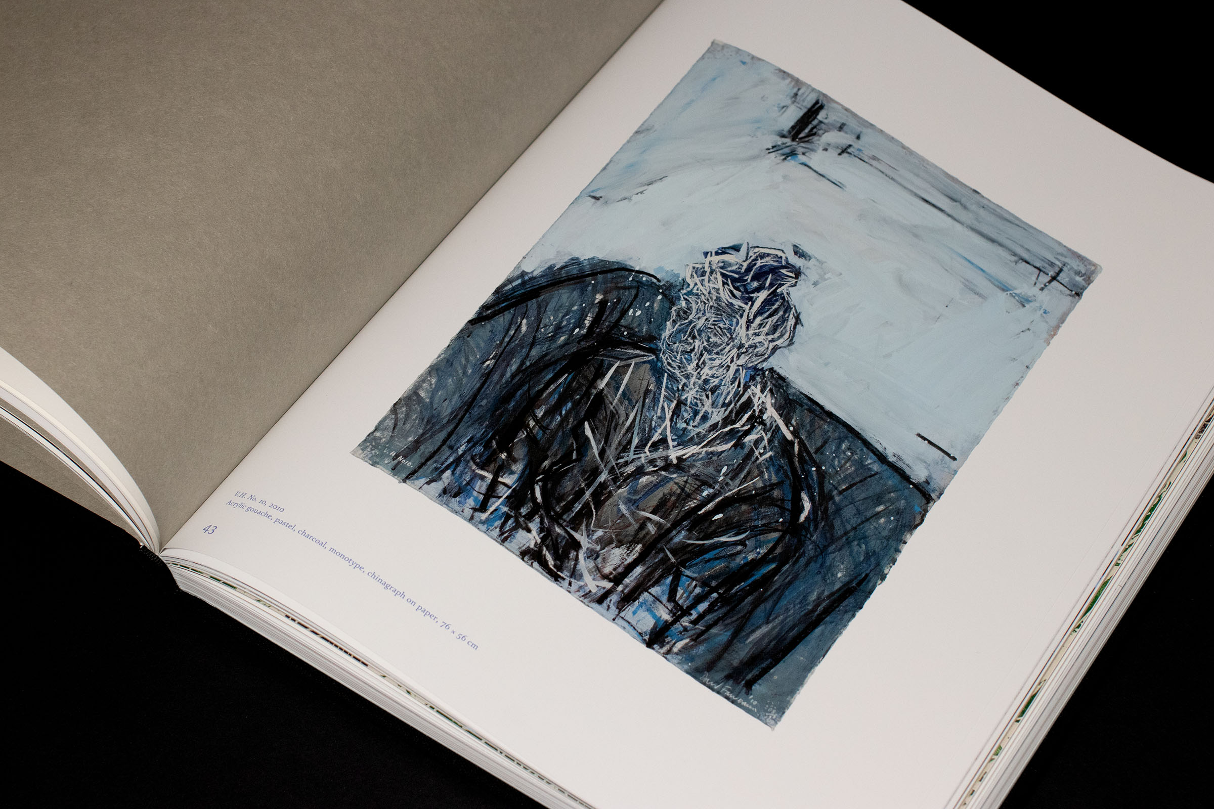
Paperworks follows a loose chronological progression, moving between Fairbairn’s major drawings and smaller etchings and prints. By bringing early sketches, developed etchings and major works together, the book reveals aspects of his extended and complex process, showing how a final artwork comes into being. The publication opens with a selection of prominent works from the past couple of decades, introducing the reader to Fairbairn’s practice before returning to his earliest works and progressing towards his most recent. The artworks are interspersed with three essays, each exploring a different aspect of the artist’s life and practice.
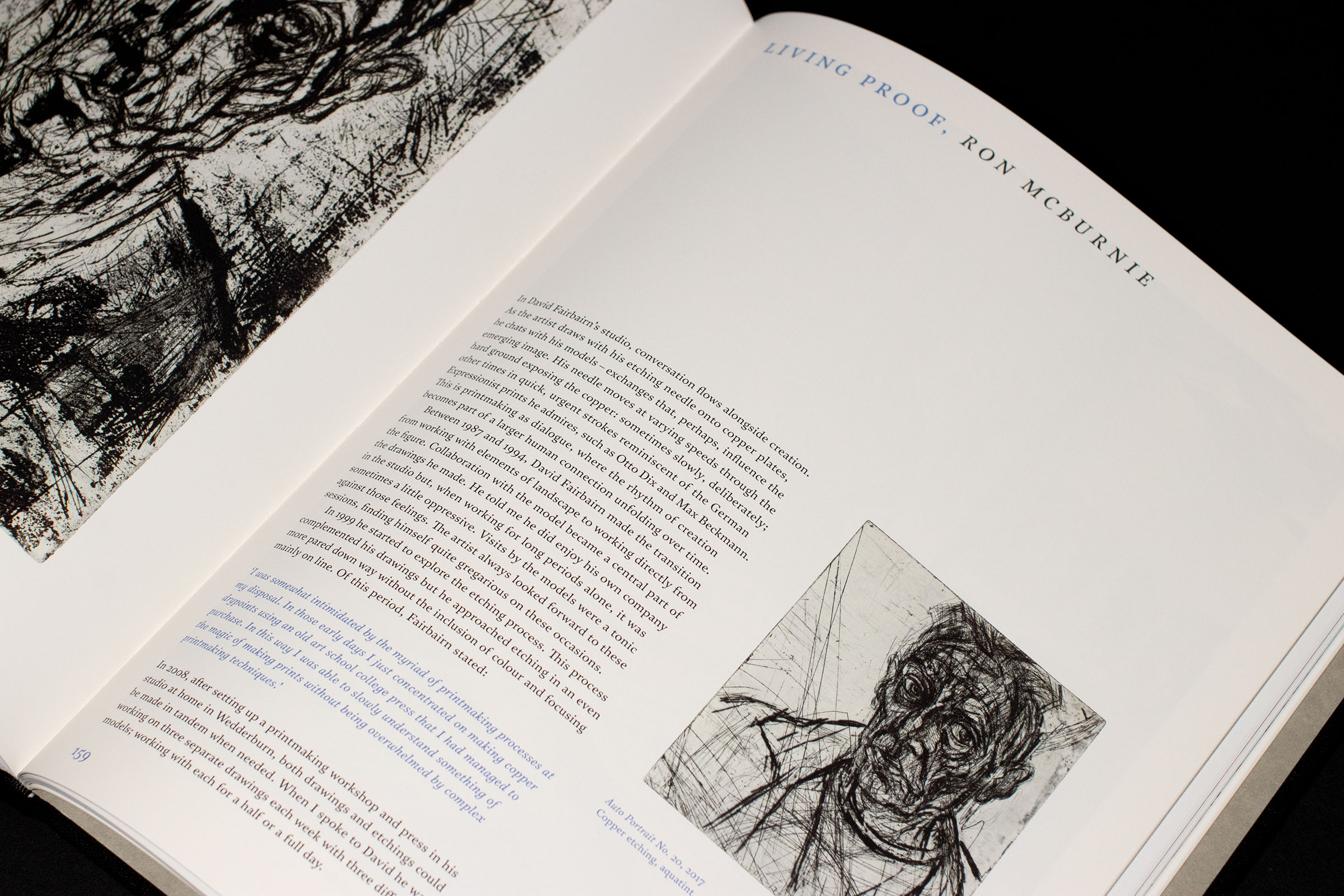
Fairbairn had a clear vision for a black cloth cover with a classic, restrained design. With this in mind, we settled on a textured cotton cover featuring an inset image of one of his major works. Inspired by Fairbairn’s characteristic rough, expressive linework, I selected Satyr and its display companion, Faunus. Both typefaces offer contemporary interpretations of classic literary typography, with distinctive convex and concave curves. Their unconventional forms give the letterforms a lively, human quality that echoes Fairbairn’s own expressive linework.
In keeping with the title and Fairbairn’s practice of working on paper, the book employs three contrasting paper stocks throughout. The artwork plates are printed on a matte-coated stock, with spot varnish applied over the works to enhance colour and detail without an overly glossy finish. Each essay section uses a creamier, uncoated stock, whose tactile texture contrasts with the smooth coated pages. Finally, a warm grey stock with a pronounced texture separates the sections, signalling a shift in content.
Featuring texts by Ralph Hobbs, Gavin Fry in collaboration with David Fairbairn, Sarah Pickering and Ron McBurnie, Paperworks offers an intimate insight into the artist’s world, tracing the evolution of his practice alongside the life that surrounds it.